GET THE LOOK – Pink Light, Blue Light
Spring is shaping up to be pastel, and so is your interior!
They bond with natural allies: coloured wood, soft lighting, and light, delicate materials. Together, they compose a perfect melody, where each element finds its place with gentleness. In the shade of designer lamps or sweet cushions, these colours reveal their full potential.
Pink light, blue light… colours! And the magic happens.
Blue, Green and Pink Soften for a Tender and Sweet Mood
Subtle and delicate, pastel colours emerge as the epitome of refinement in the world of interior design. True visual delights, they envelop spaces in a cosy and indulgent atmosphere. From aqua green to delicate peach pink reminiscent of fruity sorbet, and chestnut shades with caramelised undertones, these refined hues dress walls, furniture and decorative objects with subtle elegance.
These pastel tones infuse interiors with sophisticated lightness. Silky sky blue, powder pink, soft green and gentle yellow grace surfaces with discretion. To avoid any impression of coldness, these tones are elevated with noble and shimmering materials such as brushed brass, white marble and plexiglass. Lighting, meanwhile, is soft and enveloping, like a luminous case that reveals the subtlety of the shades.
Mastering the art of pastel colours means playing with lightness without falling into dullness; it is the union of chromatic tenderness and the indulgence of materials. Discover how to incorporate these exquisite shades and create a sensory harmony where every detail exudes softness and elegance.
get the look
What Are Pastel Colours?
Soft, light and infinitely delicate, pastel colours captivate with their timeless elegance. Much more than a mere trend, they have gracefully traversed eras. Their peak dates back to the 1950s, when they blended with brighter tones to create interiors that were both dynamic and refined. Even today, these powdery hues continue to enhance our spaces, perfectly complementing Scandinavian styles. Their chromatic softness ideally matches the warm atmospheres of Nordic design, which favours natural materials and comforting ambiences.
True decorative chameleons, pastel colours move effortlessly through the seasons. They celebrate spring renewal, refresh summer interiors, brighten autumn, and adopt frosted hues in winter for a cosy decor with Scandinavian accents. Their evocative names – opaline green, cloud blue, nude pink – reflect the sensory softness they bring to each space.
While their delicacy appeals, some critics point out their perceived lack of character or an overly "sweet" effect when used excessively. To address this, pastel tones today assert themselves in deeper variations. Enhanced by darker accents, they gain intensity and sophistication, now appearing in every room of the home with confident elegance.
Pastel Colours in Decorative Objects
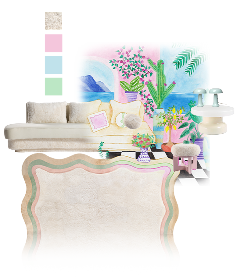
Refined and delicate, pastel colours express themselves with subtlety in decorative objects. These light, almost sugary touches bring softness and elegance to an interior. Their secret? An ability to blend seamlessly without ever striking a false note. Harmoniously combined, they create a cosy and indulgent atmosphere, soft as a cloud of cream.
Pastel Camaieu: Subtle Harmony
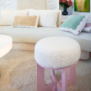
For an exquisitely refined decoration, a pastel camaieu offers a soothing and sophisticated palette. Imagine a base of pure white or light beige, serving as a luminous canvas. This immaculate backdrop allows the full delicacy of pastel shades to shine, whether it’s a misty sky blue, refreshing opaline green or powder pink as soft as meringue. To avoid monotony, subtle contrasts are introduced: a glacier blue lamp, a nude pink vase or mint-green picture frames. The result? A luminous, tender and airy universe, reminiscent of the lightness of fine pastries.
Soft Textiles: The Cosy and Indulgent Touch
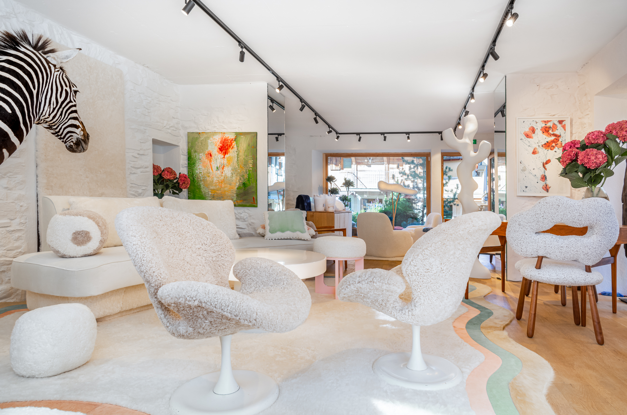
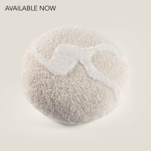
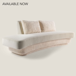
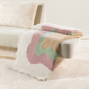
Textiles are essential in reinforcing the cocooning atmosphere characteristic of pastel colours. Sensory and comforting materials take precedence: sheepskin, curly lamb, boucle wool, cowhide and light fur. These textures evoke the tenderness of a fluffy throw or the softness of a vanilla cloud. A powder pink boucle wool cushion, a cream sheepskin rug or an aqua green bed throw create an enveloping atmosphere, worthy of a soft and indulgent cocoon. Paired with pastel shades, these textiles multiply sensations, inviting you to snuggle in as you would savour a comforting sweet treat.
The Perfect Match: When Pastels Meet Vintage Furniture
To add character to a pastel decor and avoid an overly demure or childish appearance, pairing with vintage furniture is key. Retro lines, patinated wood, brushed brass or aged leather perfectly contrast with the lightness of pastel tones. A 1950s Scandinavian armchair in beige sheepskin, a vintage walnut desk or table paired with sky blue accessories, or a plexiglass coffee table adorned with nuanced beige or colourful objects create a sophisticated and indulgent combination. This alliance of chromatic softness and retro character crafts a unique universe that is both warm and undeniably elegant.