Autumnal Lookbook | Autumn-Inspired Interior Decoration
autumnal lookbook
Autumn, an enchanting season that invites contemplation and creativity. Its vibrant colours, the gentle caress of the air, and the crunch of leaves beneath our feet make it the perfect time to rejuvenate. While orange is the emblematic colour of this season, it comes in a multitude of shades, each more fascinating than the last. Discover in this lookbook the autumnal hues that Norki loves to incorporate into its pieces...
AUTUMN...
Autumn, that time of year when nature adorns itself in its most beautiful colours before falling into winter sleep, is a season rich in symbols and traditions.
The term "autumn" has its roots in the Latin "autumnus". This term already evoked, in Roman times, the intermediate period between summer and winter, marked by the harvest of fruits and the fall of leaves. Over the centuries, this word has spread to many languages, retaining its original meaning while being enriched with new cultural nuances.
Autumn is a season that has inspired many artists and poets like Victor Hugo. It is often associated with feelings of melancholy, nostalgia, but also renewal. In many cultures, autumn is celebrated through festivals and traditions linked to the cycles of nature and harvests.
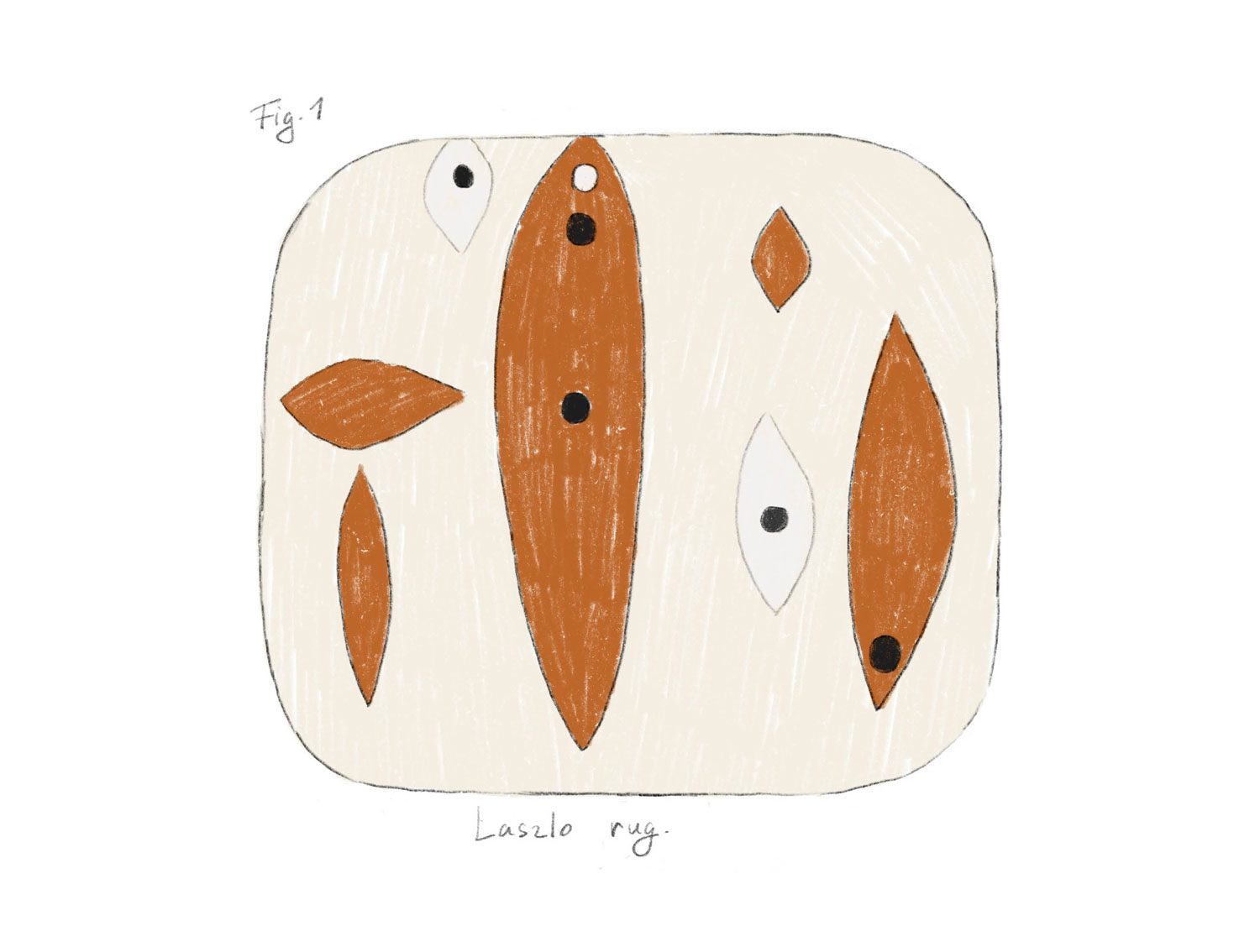
Autumn is a time of transition and renewal, where rich colours and warm textures take center stage. Whether through the Laszlo rug, the Lava Cognac cushion, and so many other Norki-signed objects, the Maison celebrates this season with creations that capture the essence and beauty of autumn.
orange: Origins Far and Wide
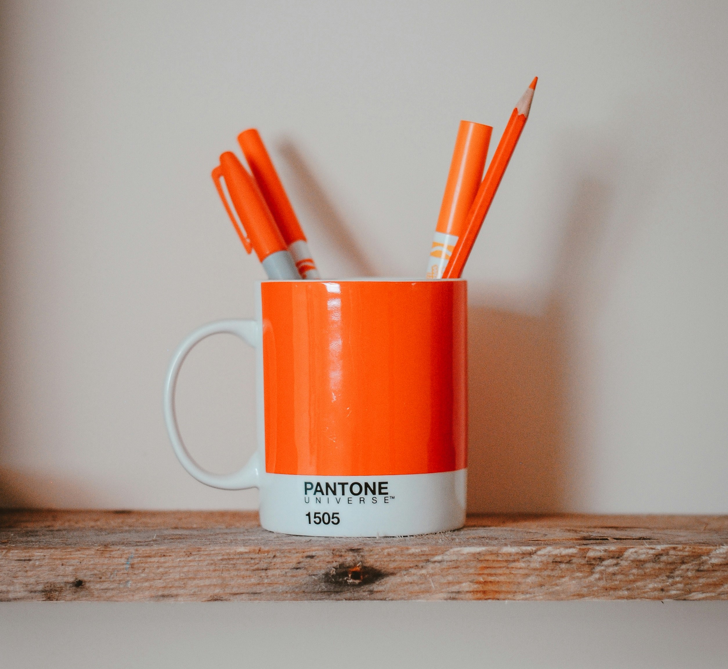
The word "orange" traces its roots back to the Sanskrit "nāraṅga", which originally referred to a bitter orange native to Persia. This fruit, introduced to Europe in the Middle Ages, gradually lent its name to the colour of its peel.
Before Orange, There Was Saffron
Before the arrival of this fruit, the colour we now call "orange" was often referred to as "saffron". Indeed, this spice was used to obtain a similar hue and was highly prized for its vibrant colour and unique flavour.
It's interesting to note that the range of colours associated with foods has expanded even further over time. For example, the colour cognac, a warm, amber brown, takes its name from cognac brandy. Often associated with rich and deep hues, this colour has seen its usage become more popular alongside the spirit's fame. Just as orange gave its name to a colour, cognac has also left its mark on our chromatic vocabulary, attesting to the close link between the world of the senses and that of words.
A Norki Rug with Orange Touches: The Laszlo Norki® Rug
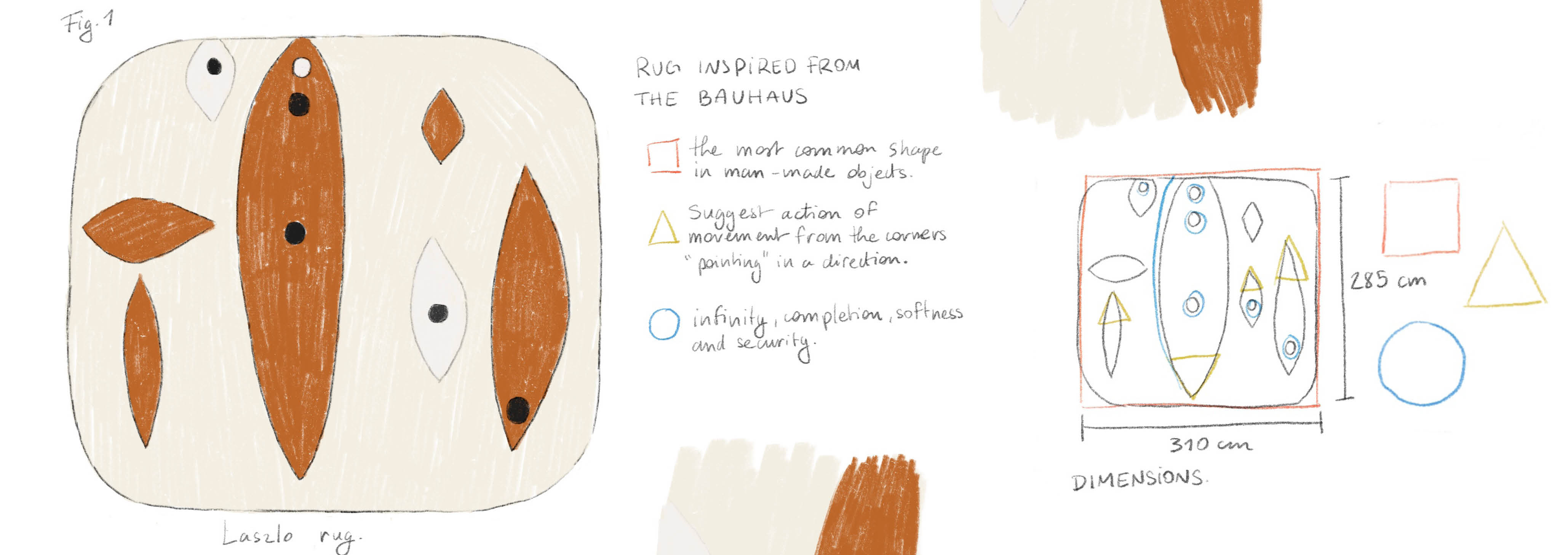
Directly inspired by the Bauhaus movement, this rug, conceived and designed by the Norki’s artistic director, Sonia Linard, intrigues us. It draws inspiration from Bauhaus ceramics, a fascinating part of this artistic movement, combining functionality, minimalist aesthetics, and technical innovation.
This movement, which reinvents the way we perceive the interaction between art, craftsmanship, and technology, gives birth to this rug. The use of colour is reduced but effective, often limited to primary colours (red, blue, yellow) and neutral tones (black, white, grey). Bauhaus ceramic creations are simple and uncluttered forms, often based on elementary geometries such as circles, cylinders, and spheres.
This piece signed by Norki is a reflection inspired by this movement, always with the quirky side of the Norki Maison.
A Norki Cognac-Coloured Cushion:
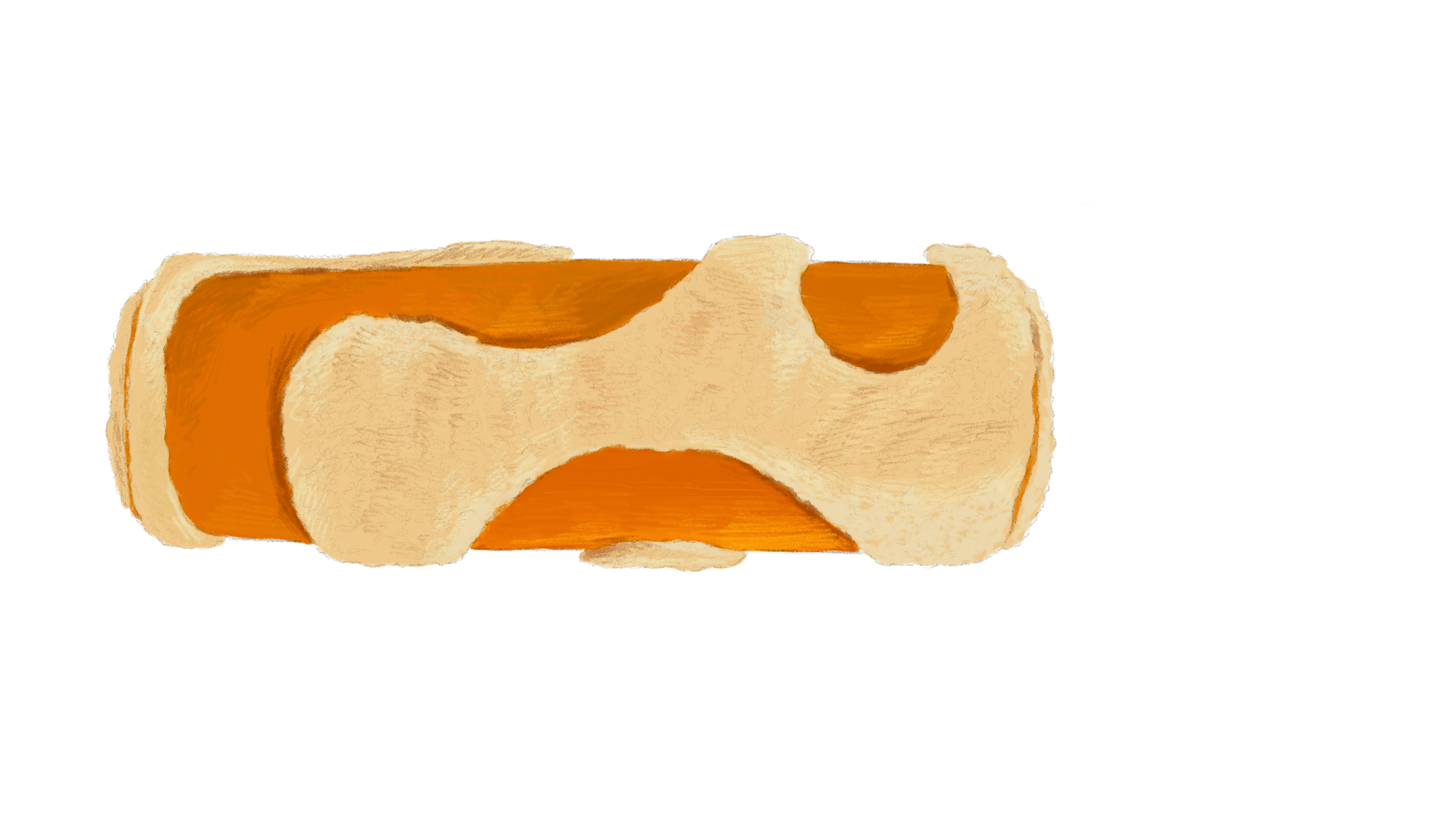
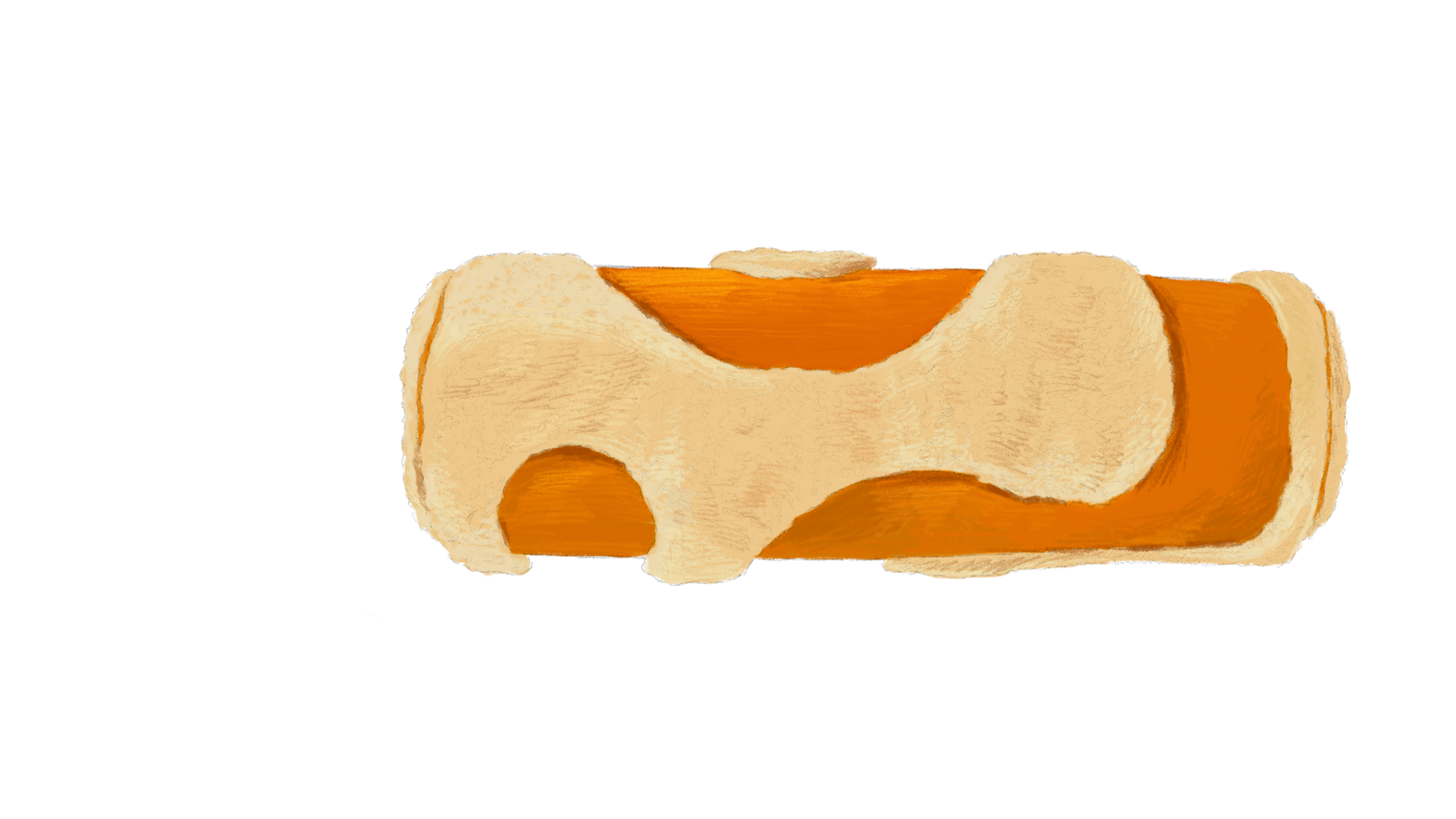
The Lava Cognac Norki® Cushion
An avant-garde piece that pushes the boundaries of classic cushion design. The Lava Cognac cushion, a boldly sophisticated Norki signature, is a daring piece that stands out from the "all-white" and conformist square or rectangular shape. A cushion that reflects the cooling evenings, cups of steaming cinnamon and orange tea.
Cognac, an Amber Hue with Golden Reflections
Cognac is that shade of light brown that immediately evokes comfort, elegance, and refinement. With its undertones of copper, amber, and caramel, this warm colour has the power to instantly warm up a room. A colour that evokes crunchy fallen leaves underfoot, the crackling of a fireplace, and the enchanting scent of an autumn evening.
